3/26/2008
Subscribe to:
Post Comments (Atom)
The Photographic Medium is a forum designed to promote the production and discussion of photography. The contributors to this dialogue will propose their own topics and contemplate others. This is a composite of its members' talents and a venue for creative output and artistic theory.
8 comments:
from photoshop to web this looks nothing like it should... bleh
this is very interesting. i dont really know how to critique this image though. i find that about most of your work.
is it good or bad that you don't know how to critique it?
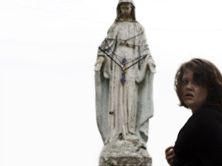
I am bothered by the cutting off of the statues head, yet the open hands, which I am drawn to (probably because the head is cut off), are a universal expression of accepting and nurturing qualities of spirituality.It seems like it's a "no photographs allowed" expression on your face. Then, I think your face isn't really giving anything away because of the personal nature of the subject. You could be surprised or angry or in mid-expression. I know you took the photo, but it seems as though you stumbled into it, like it's a mistake that you are there. That probably has more to do with the composition.
Yea I agree with the stumbling in part. - I think this is a movie still from your first music single. The camera follows you around closely on foot as you wander through a statue park and a courtyard. Its some early nineties alternative folk track. Sometimes you lip-sync or else you just make candid and painful faces. Its not a happy song.
The amount of empty space on the left doesn't sit well with me. I am all for negative spaces, but I think because there are figures cut off from the top, bottom and right side, the left feels awkward in its emptiness. Your expression and blur I like, even if they also have a certain awkwardness to them.
I want to like this for the idea behind it... and your facial expression actually kind of interests me... but I feel like I keep getting bothered by things like the composition and the technical details. It feels very "photoshoppy" to me... While obviously I don't think there's anything wrong with trying to create an image this way... I don't feel like it works because the tools you used feel too obvious to me. Everything feels too blown out and too glowing and soft. (like the gaussian blur tool faded with the overlay filter or something) I'm not sure what exactly was done to the image if anything really at all... but it just doesn't seem to have that sense of technical cleanness or sophistication. Maybe I'm too picky about these things? I'd like to see different versions of this.
thanks for the tips ill try some new edits
Post a Comment